Look at those graphs… and then you tell me (What is wrong, what is wrong?*) that chairman Xi is in the right?
That cross section and beyond? Oh, my sweet Lord! Look at the graphs.
It was a long time ago I dabbled with maths and graphs, but looking at these ones… what can I say?
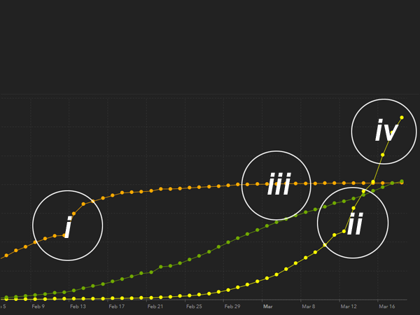
- Orange = Infected mainland China.
- Green = Recovered globally (including China).
- Orange = Infected mainland China 10th of March 2020.
- Yellow = Infected rest of the World 18thof March 2020.
I did see it, however I did not foresee it… now the infection is completely out of control and quite frankly it is scary. You are being a hysteric? No, seriously look at the graphs. I mean just look at the steepness of that graph…
The 18th of March 2020.